Logo Design
To celebrate the launch of our store, here's a visual guide to the logo design process. I worked with artist Lindsay Gardner to create an organic, hand-drawn logo to complement my digital maps. The logo acts as a signature and as a design element that has become integral to each map that gets printed. Check out Lindsay's other work on her website linked just above, and drop her a note at lindsaygardnerart@gmail.com if you would like to work with Lindsay on any design and illustration needs.
To start the process, I provided Lindsay with a few draft maps along with initial logo ideas and designs I had created myself, to give her a sense of the aesthetic and colors I would be working with.
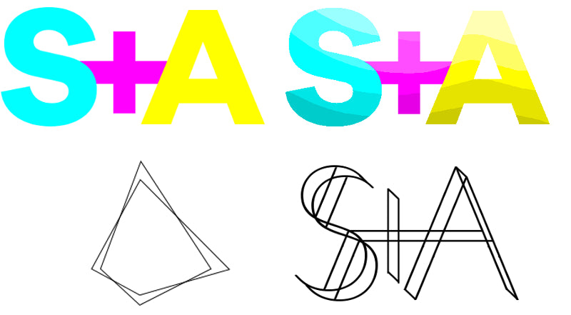
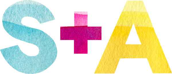
I generally liked the look of these images, but they did not have the organic quality that I was looking for. So, Lindsay went to work, and sent me these amazing designs.
![]()
![]()
![]()
![]()
![]()
![]()
![]()
The clear standout for me was logo 1A. The final design was clean, organic, but simultaneously bold. The grayscale of the logo works great with the bright colors of our maps. Thanks for your amazing work, Lindsay!
