Posts

Slope + Aspect Art Show Posted on 15 Sep 20:27 , 0 comments

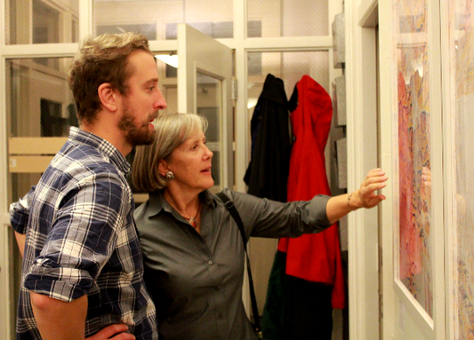
Many, many months later, I am finally getting around to posting photos of my art opening from last fall at Local 64, Montpelier, Vermont's co-working space.  I printed 20 poster-sized Slope + Aspect maps to display throughout the office, and we had a great turnout - everyone had a chance view my work, chat about my mapping process, and eat cheese! The maps worked beautifully in the space, and the event was a great success!  


An Interactive Slope and Aspect Map Posted on 26 Jun 17:24 , 1 comment

I was recently in awe of the fantastic work of Mapzen and their custom terrain maps. If you have some time, read the Mapping Mountains blog post here.  I figured there had to be a way to build versions of these custom maps that showed both the Cyan / Magenta / Yellow and Navy / Orange / Yellow slope and aspect maps available as prints on our website.  Following Mapzen's lead, I used GIMP to create spheremaps for both the CMY and NOY versions:

cmy gradient noy gradient

Sample code can be downloaded from Mapzen's terrain demos Github page here.

I was able to switch out my custom spheremaps with their spheremaps, and after a little trial and error, the results were better than I expected.

If you would like me to build a print-ready map of a custom area, you can click on "View Full Map" for either of the maps below, then navigate to your preferred location and zoom level, then send the resulting URL to slopeandaspect@gmail.com, and I will get a high-resolution map poster ready for you.  Thanks, and have fun!

View Full Map  >>

View Full Map  >>


Logo Design Posted on 27 Oct 22:00 , 0 comments

To celebrate the launch of our store, here's a visual guide to the logo design process.  I worked with artist Lindsay Gardner to create an organic, hand-drawn logo to complement my digital maps.  The logo acts as a signature and as a design element that has become integral to each map that gets printed.  Check out Lindsay's other work on her website linked just above, and drop her a note at lindsaygardnerart@gmail.com if you would like to work with Lindsay on any design and illustration needs.

To start the process, I provided Lindsay with a few draft maps along with initial logo ideas and designs I had created myself, to give her a sense of the aesthetic and colors I would be working with.

I generally liked the look of these images, but they did not have the organic quality that I was looking for.  So, Lindsay went to work, and sent me these amazing designs.


The clear standout for me was logo 1A.  The final design was clean, organic, but simultaneously bold.  The grayscale of the logo works great with the bright colors of our maps.  Thanks for your amazing work, Lindsay!